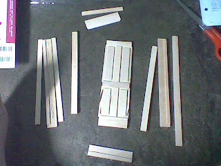
The box consists for a wall or a floor, then a furniture. Or a furniture, then the small parts and pieces (e.g. kitchen utensils). It comes with instructions, which you can compile and place it in a binder. It also comes with a parts' page, like an inventory of the things you get in the box. It also has this mini magazine of some of the things you may do with the parts and/or layout you can come up with.
1. Sample box and parts
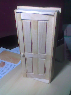
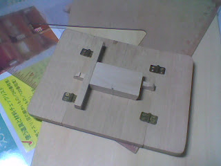
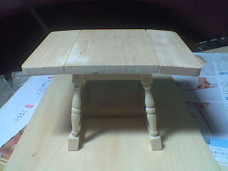
2. Assembly
a. Door
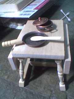
b. Folding table
Here are the completed kitchen utensils. Hmmm...I should've made a size comparison...
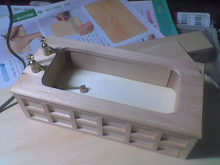
c. Bathtub
Most of the parts that was done were kitchen things, so having this bathtub is a bit odd. Nevertheless, it's going here on this post as well.
Note. The bathtub is done by my brother.
Okay, I'll stop here. I need to find the assembly pictures of the rocking chair and the cabinet hehehe~
It won't be long now~
Monday, January 25, 2010
Sunday, January 17, 2010
Old shoe, new birdhouse
So I found this lurking in the interwebs, and it needed to be posted.
- Source
I especially liked the part wherein you can untie the shoelaces to clean the birdhouse.
~~~~~~~~~~~~
If you've noticed, I'm not posting as much as I should've. Well, to tell you guys some news, I'm working on some DIY projects. I just don't have the right equipment to transfer the pictures. Those are being taken care of (a.k.a as soon as sister and her laptop comes home haha), I'll post them here.
I'm excited with the projects, and I hope you will too.
Thank you for bearing with me~
An easy to make and easy to clean out birdhouse. Just undo the laces to clean it out. The boot was thrown in the trash and I rescued it. Screwed the board to the sole, added the roof made of flashing and a raffia shoelace. I love it and so did a Carolina Chickadee family this year.
- Source
I especially liked the part wherein you can untie the shoelaces to clean the birdhouse.
~~~~~~~~~~~~
If you've noticed, I'm not posting as much as I should've. Well, to tell you guys some news, I'm working on some DIY projects. I just don't have the right equipment to transfer the pictures. Those are being taken care of (a.k.a as soon as sister and her laptop comes home haha), I'll post them here.
I'm excited with the projects, and I hope you will too.
Thank you for bearing with me~
Tuesday, January 5, 2010
Dvorak Simplified Keyboard
The one we're using is the standard Qwerty Keyboard invented by C. Latham Sholes in the 1860s. In 1936, August Dvorak invented this kind of keyboard layout according to how we use the letters and how we type them. He is, after all, a psychologist (educational).
Here are some facts about the keyboard:
1. Letters should be typed by alternating between hands.
2. For maximum speed and efficiency, the most common letters and digraphs should be the easiest to type. This means that they should be on the home row, which is where the fingers rest, and under the strongest fingers.
3. The least common letters should be on the bottom row, which is the hardest row to reach.
4. The right hand should do more of the typing, because most people are right-handed.
5. Digraphs should not be typed with adjacent fingers.
6. Stroking should generally move from the edges of the board to the middle. An observation of this principle is that, for many people, when tapping fingers on a table, it is easier going from little finger to index than vice versa. This motion on a keyboard is called inboard stroke flow.
Though they weren't successful as the mainstream keyboard, it had found its way to newer platforms and ergonomic keyboards.
Source
I just find this fascinating. And then this comic shows up:
Maybe it IS interesting to learn a new keyboard.
Monday, January 4, 2010
MAKI STOOL!!
noji-berlin released a new set of seating and lightning designs, and one of them is the Maki Stool.
The idea for the MAKI collection came to us while eating sushi. The stools are abstract versions of maki rolls inspired by the original. One wants to sit down on the funny little chairs made of wood and felt and enjoy the sensation of being like a child. nojiberlin loves the carefree nature of youth.
I'd love to have one of these in my room~
Source.
Sunday, January 3, 2010
I'm thinking of doing something like this:
Subscribe to:
Posts (Atom)