Thursday, November 26, 2009

Helsinki named World Design Capital!


Congratulations!

They call it a mobile office. I call it a giant pop up!

And that's a good thing. I saw this, and my childhood fantasies just went on hyperdrive!


The "Pop Up" office is created by Liddy Scheffknecht and Armin B. Wagner. It fold up into one panel, and you can take it anymore. It doesn't look like it's strong enough, though, but looks fun nevertheless.

Source.

Tuesday, November 24, 2009

Adults may be proned to Visual Illusion more than children.

Sometimes seeing means deceiving before believing, depending on your age. Children and adults size up objects differently, giving youngsters protection against a visual illusion that bedevils their elders, a new study suggests.

This unusual triumph of kids over grown-ups suggests that the brain’s capacity to consider the context of visual scenes, and not just focus on parts of scenes, develops slowly, say psychologist Martin Doherty of the University of Stirling in Scotland and his colleagues. Even at age 10, children lack adults’ attunement to visual context, Doherty’s team concludes in a paper published online November 12 in Developmental Science.

As a result, visual context can be experimentally manipulated to distort adults’ perception of objects’ sizes. But Doherty’s group finds that children, especially those younger than 7, show little evidence of altered size perception on a task called the Ebbinghaus illusion.

“When visual context is misleading, adults literally see the world less accurately than they did as children,” Doherty says.

This pattern holds for Scottish children and adults in the new study as well as for Japanese children and adults who participated in other investigations conducted by Doherty’s team.


Some researchers argue that East Asians focus broadly on the context of what they see while Westerners focus narrowly on central figures. Doherty says the new findings instead indicate that adults in both Scotland and Japan can’t help but track visual context, although this tendency was stronger in the Japanese adults.

Other investigators have noted that children with autism don’t succumb to visual size illusions, consistent with the idea that autism involves an excessive focus on details. But visual context largely eludes all young children, not just those with autism, Doherty asserts.

Even if the new findings hold up, it’s still possible that further research will show that children with autism develop a susceptibility to size illusions more slowly than those without it, remarks psychologist Danielle Ropar of the University of Nottingham in England.

Psychologist Carl Granrud of the University of Northern Colorado in Greeley calls the new study convincing but “somewhat surprising.” Children exhibit sensitivity to visual context on some other visual tasks, he says, such as one in which two equal-sized horizontal lines are perceived as differing in length when flanked by diagonal lines.

Earlier research has yielded conflicting evidence that children fall prey to the Ebbinghaus illusion, partly because of weaknesses in study designs, Doherty says.

His team studied 151 children, ages 4 to 10, recruited from a Scottish primary school and nursery school. Another 24 volunteers, ages 18 to 25, were college students.

Participants viewed a series of images containing pairs of orange circles in which one circle was 2 percent to 18 percent larger than the other. An experimenter asked participants to point to the circle that “looked bigger.”

Control images showed only two orange circles. In other images, each orange circle was surrounded by gray circles intended either to hinder or aid accurate size perception.

Misleading images showed the smaller orange circle surrounded by even smaller gray circles to boost its apparent size. Large gray circles surrounding the larger orange circle were intended to shrink its apparent size.

In helpful images, large gray circles surrounded the smaller orange circle to make it appear smaller than it actually was. Small circles surrounded the larger orange circle to magnify its apparent size.

Four-year-olds correctly identified the larger circle in 79 percent of control images. That figure rose with age, reaching 95 percent in adults.

For 4- to 6-year-olds, accuracy of size perception for misleading images remained at about what it was for control images. Misleading images increasingly elicited errors from older children and tricked adults most of the time. Adults made almost no errors on helpful images. Kids from age 7 to 10 erred on a minority of helpful images, while 4- to 6-year-olds performed no better than chance.


Source: Wired Science

Saturday, November 21, 2009

UP AME update: A more detailed map


Again, it's this Saturday, November 28, 2009 in A Venue hall.

Pre-sale tickets are P90. Get them now~!

Thursday, November 19, 2009

Design comments

So here are some designs and my take on each of them.


Chris Duffy's chair that seems to defy gravity. At first take, you'll notice that this chair doesn't have any back legs, and yet it's still standing. But if you do a double take and notice that the shadow itself is part of the chair (Woopsie. Did I just spoil you?) It's a really fun furniture to...scare your friends, maybe. Source.


Shrub Tables by Zhili Liu. I think that this set is fine and all, but what really took me was this picture:


I know it doesn't have anything to do with design, but isn't it that in making a prototype, proper protection is a must? Then again, this also tells something about the welder's resourcefulness...Source


Oaza Zdravlja Pharmacy by Karim Rashid. First words that came into my brain was "BUBBLEGUM DRUGS!!!"

Yes, that's a pharmacy. I'm unsure about this design, firstly because it's inappropriate for the function of the establishment (drugstore). The kids would prolly take it as a candy store instead of a drugstore. Source.

And last but not the least...


Cellulose Meeting Pods by Paul Coudamy. I give it an A for functionality, but a C on design. Well, it looks like a makeshift house for the homeless. Give it a little color, at least, so the meeting experience will be a bit...memorable.

Oh, and I think this will be perfect for a small study group. Source

Best Plurk Layouts for 2009

See full list.


Yes, I have a plurk account. Hahaha.

Finally found that Lady Gaga vid!

...where she's wearing some crazy pair of shoes:


Here it is:


For more information, you can go to that post (already edited because I already found it).

Wednesday, November 18, 2009

Wallpapers are not so boring anymore

Remember when I put up a post about some wall treatments that one can do in their home some days ago? Well, here's another interesting take on wall treatments. It's decorative and functional as well. It's a wallpaper design by Kicki Edgren Nyborg (hm, last name rhymes with Cyborg. Interesting).


Source.

The Art of Tim Burton (Standard and Deluxe Edition) is now taking pre orders!

The Art of Tim Burton is the definitive compilation of forty years of Tim Burton's artistry, including film concepts and hundreds of illustrations from his personal archives, edited under the creative guidance of Burton himself. This comprehensive 434 page book is grouped into thirteen chapters that examine common themes in Burton's work, from his fascination with clowns to his passion for misunderstood monsters, to his delight in the oddities of people. Many of Burton's friends and collaborators offer their thoughts, insight and anecdotes about Tim Burton's style and artistic approach to life.


Artwork from the following films and projects are included in this book:
Alice in Wonderland (2010)
Sweeney Todd: The Demon Barber of Fleet Street (2007)
Charlie and the Chocolate Factory and Corpse Bride (both 2005)
Big Fish (2003)
Planet of the Apes (2001)
Sleepy Hollow, (1999)
Mars Attacks! (1996)
Ed Wood (1994)
The Nightmare Before Christmas (1993)
Batman Returns (1992)
Edward Scissorhands (1990)
Family Dog (1987)
Batman (1989)
Beetlejuice (1988)
Pee-Wee's Big Adventure (1985)
Frankenweenie (1984)
Vincent (1982)
Hansel & Gretel (1982).

The book also contains additional drawings from his illustrated book of poetry The Melancholy Death of Oyster Boy & Other Stories (1997), and from The World of Stainboy web shorts (2000).

You can arrange for your pre-orders in Steel Publishing.
Official Site of Tim Burton

AME no Jidai

Again, advertising the UP AME's anime fair for this year.

AME no Jidai. November 28, 2008. A-Venue Hall, Makati.

Tuesday, November 17, 2009

Ang INK Exhibit: Forever RENEver

On its 18th year, Ang Ilustrador ng Kabataan (Ang I.N.K.) presents its annual exhibit for 2009, entitled “Forever RENEver,” a tribute to the late children’s writer Rene O. Villanueva, whose literature has showcased I.N.K. illustrators’ works for several decades now.

Ang I.N.K. pays tribute to one of the most celebrated figures in the landscape of Filipino children’s books with a showcase of more than 30 works that bring to life Rene’s never-been-illustrated literature.

Join Ang I.N.K. in honoring the memory of Rene O. Villanueva, and in ensuring that his legacy lives on in the hearts and minds of future generations of Filipino readers.

Start Time:
Thursday, November 19, 2009 at 7:30pm

End Time:
Sunday, November 29, 2009 at 8:00pm

Location:
CCP Little Theater Lobby

Visit their Website.

Crayola Fun Facts

An article from COLOURLovers gave me nostalgia. Then again, anyone who used Crayola would find themselves remembering their colorful childhood.

For the last 100 years or so kids have been exploring and creating worlds of color with Crayons. For a lot of us, our life long love affairs with color began with these wax sticks and a blank sheet of paper. According to a Yale University study, the scent of Crayola crayons is among the 20 most recognizable to American adults. Coffee and peanut butter are 1 and 2. Here we go down crayon color memory lane with all 120 color names and hex codes, fun facts and photos.


Fun Facts:

1. There are 120 Crayon names including Fuzzy Wuzzy Brown, Macaroni and Cheese, and Outer Space.

2. The first box of Crayola crayons was sold in 1903 for a nickel and included the same colors available in the eight-count box today: red, blue, yellow, green, violet, orange, black and brown.

3. Most Crayola crayon color names are taken from the U.S. Commerce Department's National Bureau of Standards book called "Color: Universal Language and Dictionary of Names." Many crayon names are also borrowed from traditional artists' paints.

4. Crayola crayon colour names rarely change. However, there are exceptions. In 1958, Prussian blue was changed to midnight blue in response to teacher recommendations that children could no longer relate to Prussian history. In 1962, the colour flesh was changed to peach recognizing that not everyone's flesh is the same shade.

Source

Stumbling upon awesome music

An officemate gave me a link in one of Stumbleupon's pages. It's labeled "Audiogravity 18th September". Here's a screenie:


...but you have to experience it first hand. Here's the link.

Monday, November 16, 2009

Korean Culture Week Festival:


For details, do get in touch with the Embassy of the Republic of Korea, 811-6139-44, or CCP.

Thanks for the heads up, k1lljoy!

Nick Brandt Black and White Photography about Africa

Born and raised in London, Nick Brandt studied Film and Painting at St. Martins School of Art.

He started photographing in December 2000 in East Africa, beginning the body of work that is his signature subject matter and style. He no longer directs, devoting himself full time to his fine art photography now.

Brandt's first book of photographs, "On This Earth", was published in October 2005, by Chronicle Books, with forewords by Jane Goodall and Alice Sebold (author of "The Lovely Bones").

He has had numerous one-man exhibitions between 2004 and 2006, including London, Berlin, New York, Los Angeles, Hamburg, Santa Fe, Sydney, Melbourne and San Francisco.

He now lives in Topanga, California.


Here are some of his cool shots. I swear, his photographs are love.


More about Nick Brandt here.

Wonder wall

A wall is important because it keeps away rain, and sun from entering the house. And provides foundation for the windows and doors (and roof, but then again, there are pillars for that).

It's also a good canvass for some decorating ideas. Here are some:

Photo Collage : Perpetual Wall Calendar

The perpetual wall calendar is a beautiful collage of photos that Littlebrownpen has collected while in Paris. Chalkboards, license plates, doorways, bottles, monuments. 49 glimpses of Paris that capture the the essence of the city at street level. All you have to do is to arrange the photos according to the current month and clip them together using the clear photo clips provided. After that you just have to hang it. The assembled collage is roughly 3ft x 3ft. The idea is very interesting and if you have some time and you love to take pictures you can even make your own version, or buy this one from here.


As the quote said, it's a nice idea on a wall, yet functional. You can indeed make your own version, using local scenes. Or have a photograph of your friends holding up a piece of the square, and then take a picture of it.

Source.

Framed Objects by The.

No, the sentence has not been cut short. The is a group of eclectic wares designers.

A simple frame can take an everyday object and turns it into a quirky and interesting art piece. Framing a key chain or coat hook is another way to make a functional home accessory stylish and contemporary. With this simple idea you can Turn flowers, books, keys, jewelry, articles of clothing, and other ordinary objects into works of art. This product called “Framed Objects” is available from Thinkofthe.


I think this is an easy DIY project to do at home.

Source.

Sunday, November 15, 2009

I am not sure about this [Edited: Lady Gaga seen wearing McQueen's shoes in new vid]


Lady Gaga was seen wearing these. What do you think?

Source

Edit:

The shoes were designed by Alexander McQueen, and those are not the kind of shoes he designed, which described as lobster claws."


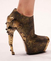
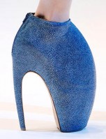
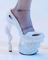
They came in three main varieties: first, ultra-high booties that looked more like prosthetic lobster claws than shoes you might see on the racks at Neiman Marcus, in keeping with the apocalyptic-aquatic theme of the show. These came in exotics, smooth leathers, and a variety of exterior embellishments, including shards of turquoise. The second type were booties that looked like something a resident in Wall-E’s post-apocalyptic Earth might wear. The heels were covered in an amalgamation of industrial metal, creating perhaps the most wearable shoes of the collection. The third type were intricately carved porcelain platforms that were reminiscent of a coral reef, held on to the foot by clear plastic straps.


I especially like the second type (third pic), but it's still not something I would want to wear hehehe.

Link.

The video Lady Gaga was seen wearing a pair is her latest video "Bad Relationship"


Just to point out, here she is wearing one of McQueen's designs:

Saturday, November 14, 2009

100% Biodegradeable chair.


Okay, maybe the legs are not, but hey, the rest are biodegradable. It's the Compos Lobby Chair by Samuli Naamanka.

Designer Samuli Naamanka has created the Lobby chair for the Finnish manufacturer, Piiroinen.

Normally, you might expect a chair like this to be made from plastic or fiberglass, but Samuli Naamanka has instead designed the chairs to be made from a 100% biodegradable natural fibre. The seat doesn’t contain any inorganic materials, not even binding substances. There aren’t even any oil based materials used in the chair.

After the chair has been used for a long time, the seat material can be milled and used again for the production of a new product. At the end of the life cycle, the seat can also be demolished by composting it for about 80 days.


Source.

Thursday, November 12, 2009

Website: Things we forget


Stumbling on to this gem is fortunate. Not because of the novelty idea of using post its to convey the message, but the messages itself and how it is conveyed.


See for yourself.

When I was a kid, I wanted to be a Ghostbuster


I know Halloween's already over. But I was browsing the internet and came across this. And I was, like, "why didn't I see this sooner!"


Anyway, here's the link of the step by step guide of making the Ghostbuster costume~!

Wednesday, November 11, 2009

The Lomo LC-A+ Customization Competition


Design the LOMO LC-A+ Your Way!

Still part of our LOMO LC-A 25th Anniversary Celebrations, we’re giving all you design-minded analogue heads the opportunity of the lifetime! Your task is to create a custom skin for the legendary LOMO LC-A+. Design it with any medium you want, but keep in mind that the winning entry is meant for mass production! With your efforts, we are giving out unarguably one of the best prizes we’ve had for a Rumble ever – read on!


The Grand Prize

A life-changing opportunity to see your design concept transformed into a limited edition LOMO LC-A+ and sold all over the world!

Priceless exposure in the design field.
A 3-day trip to the Lomography HQ in Vienna. Hotel and flight included.
5 of your self-designed LOMO LC-A+ cameras.
Runners-up will see their design concepts in a future newsletter, gallery and who knows – an exhibit of the best works!


More information here.

Not your ordinary bunker

Found this while browsing TheChive. Too bad, there aren't any more references for this.


In fairness, the interiors makes up the bleh looking exterior (but it's a bunker! It doesn't have to be painted pink just to make it un-bleh).